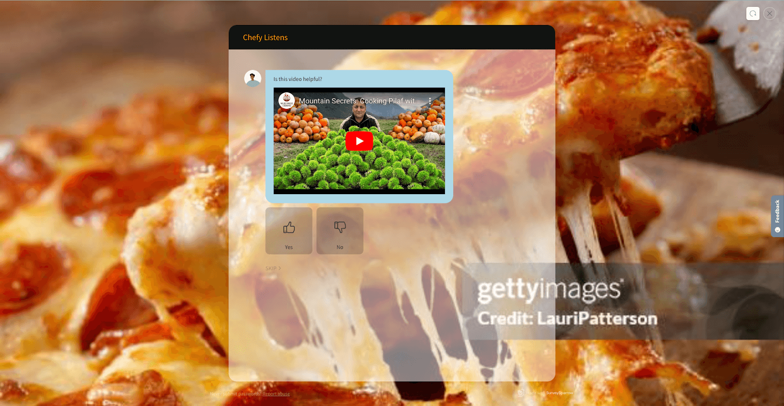
Custom CSS

Personalize every aspect of your survey theme effortlessly with Custom CSS
Wish you could add your own personal touch to a survey theme? With the CSS Customization feature, you can personalize every aspect of your survey theme, such as font, progress bar, background color, buttons, and so much more!
Let’s see how it works:
1. On your survey builder interface, navigate to the Design section. Select the ‘Create New Theme’ tile.
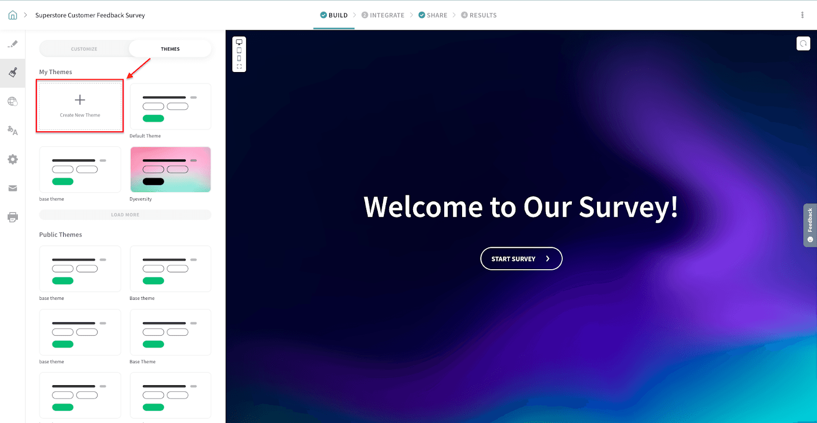
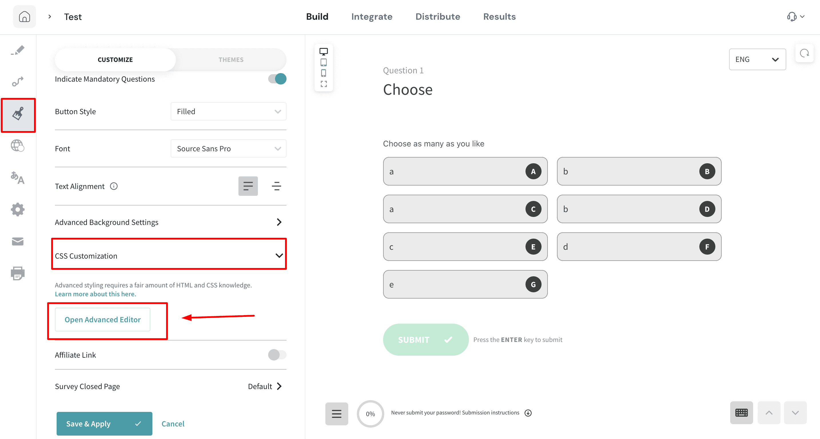
2. Under CSS Customization, click on the ‘Open Advanced Editor’ button.
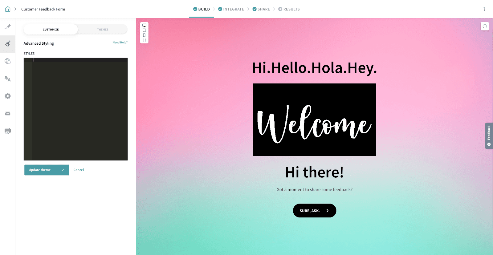
3. In the Advanced Styling editor, add your CSS code. Once you’re done, click on the 'Update theme’ button.
4. Click the “Save & Apply” button under the Customize tab to save the changes.
Now, let’s see the most commonly used CSS customizations. You can copy and paste them to the Advanced Styling code editor to see the customizations in action.
For Classic surveys:
1. To hide the survey question numbers.
.ss_cl_survey_qstn_left
{
   display: none !important;
}
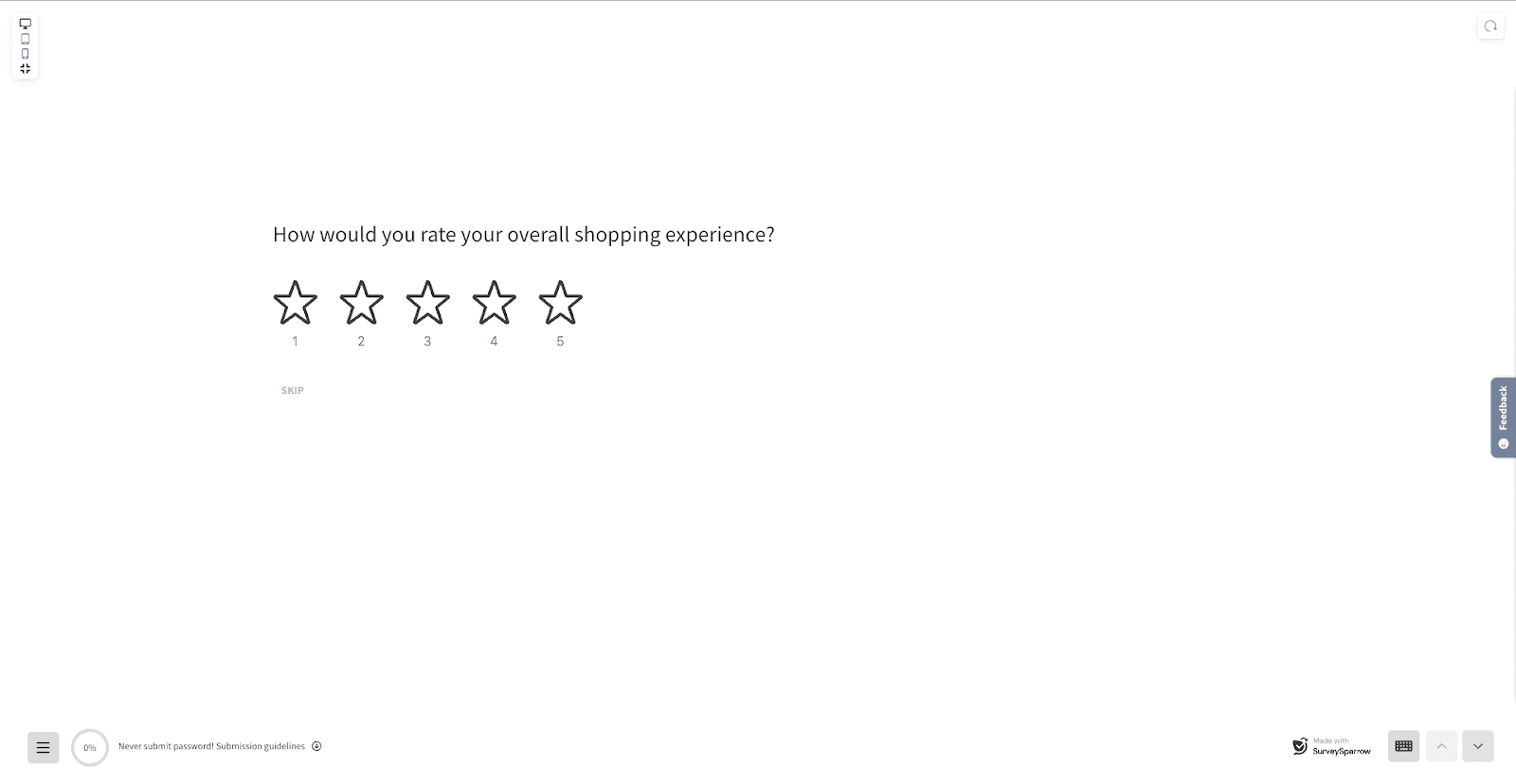
2. To Make the buttons rectangular.
.ss-primary-action-btn
{
 border-radius: 2px !important;
}
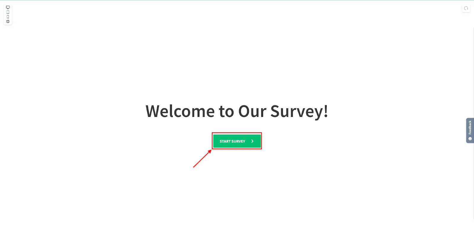
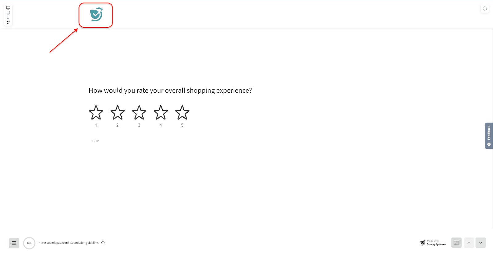
3. To align the header logo to the left.
.surveysparrow-survey-container--classic-form .ss_classic_top_bar .ss-survey-header__logo--image-holder
{
  justify-content: flex-start;
}
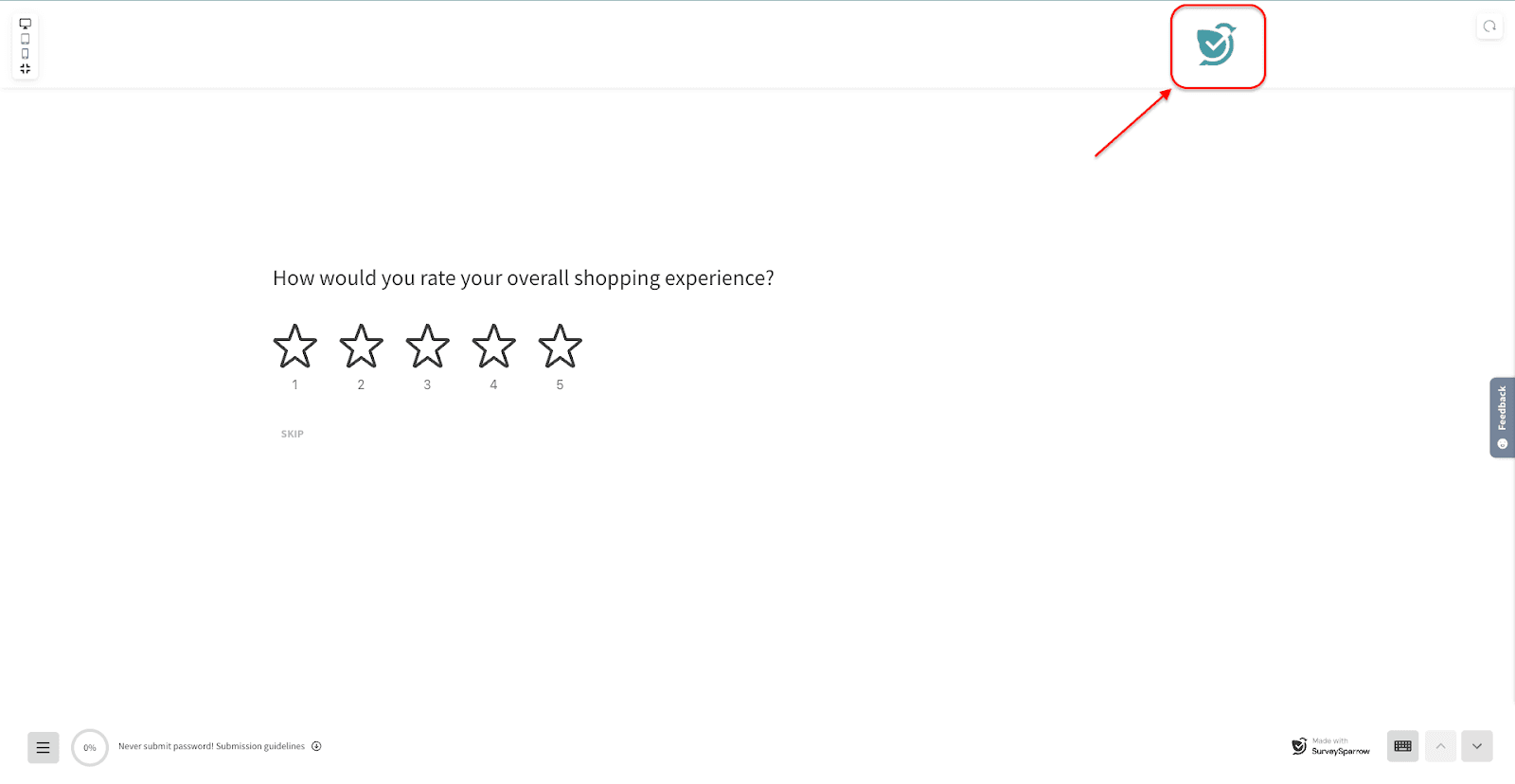
4. To align the header logo to the right
.surveysparrow-survey-container--classic-form .ss_classic_top_bar .ss-survey-header__logo--image-holder
{
   justify-content: flex-end;
}
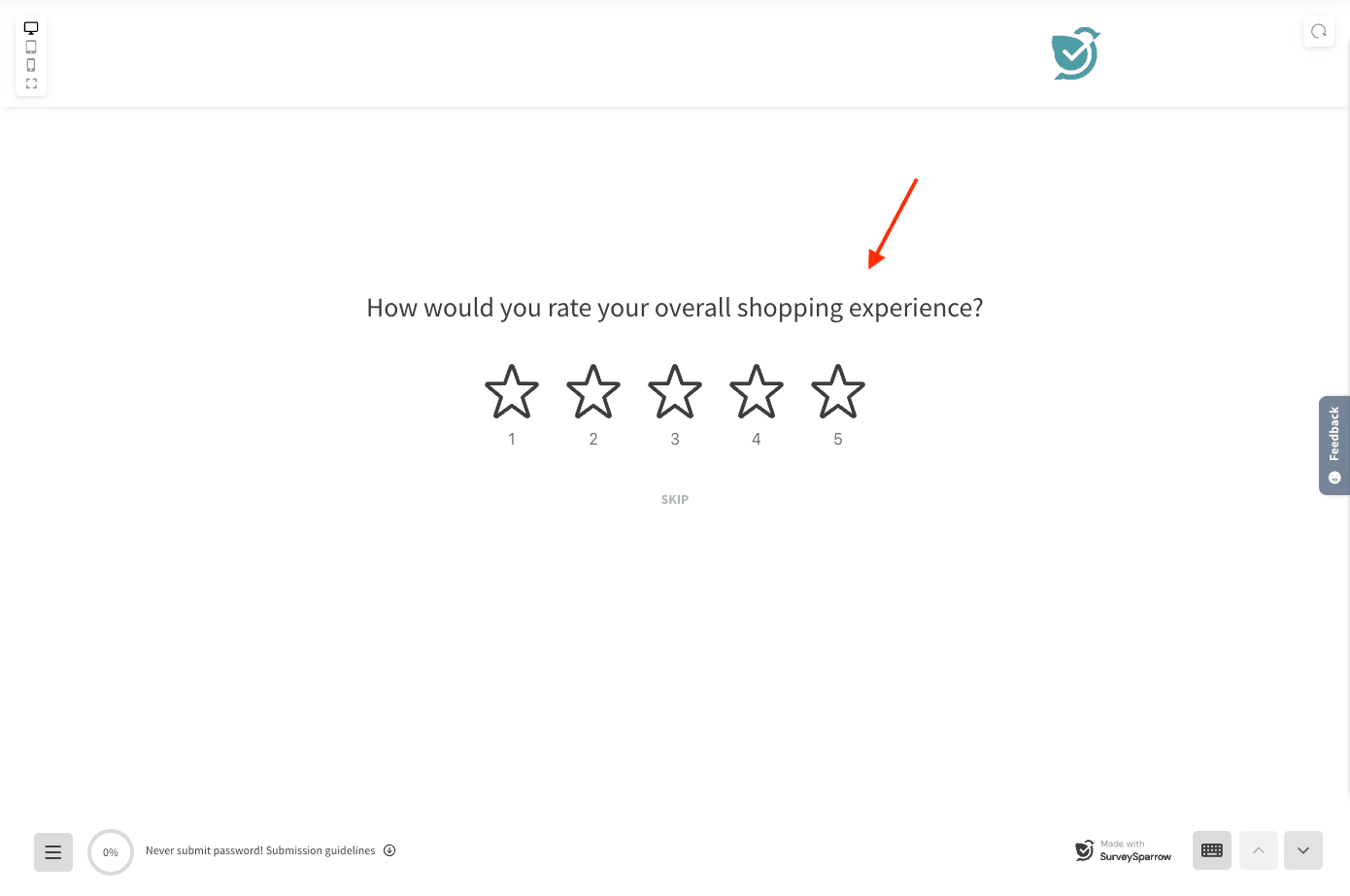
5. To center align all the questions
6. To left align all the questions .ss_cl_survey_qstn, .ss_cl_survey_qstn_left { text-align: left; }
.ss_cl_survey_qstn,
.ss_cl_survey_qstn_left {
text-align: center;
}
.surveysparrow-survey-container--classic-form .ss_cl_survey_qstn_item .ss_options_container,
.surveysparrow-survey-container--classic-form .ss_classic_top_bar .ss_classic_top_bar_section_details,
.surveysparrow
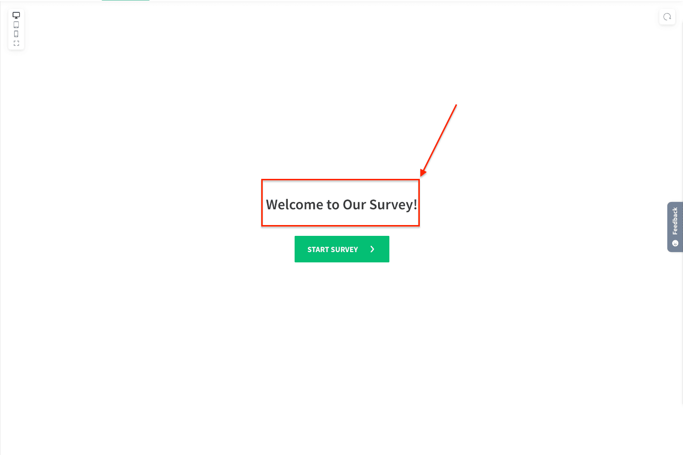
6. To customize font size on the Welcome page
/*Main title*/
.ss_classic_survey_intro_contents h3.ss-survey-heading--text
{
    font-size: 30px !important;
}
/*Description*/
.ss_classic_survey_intro_contents .ss-survey-text-question-text{
    font-size: 20px !important;
}
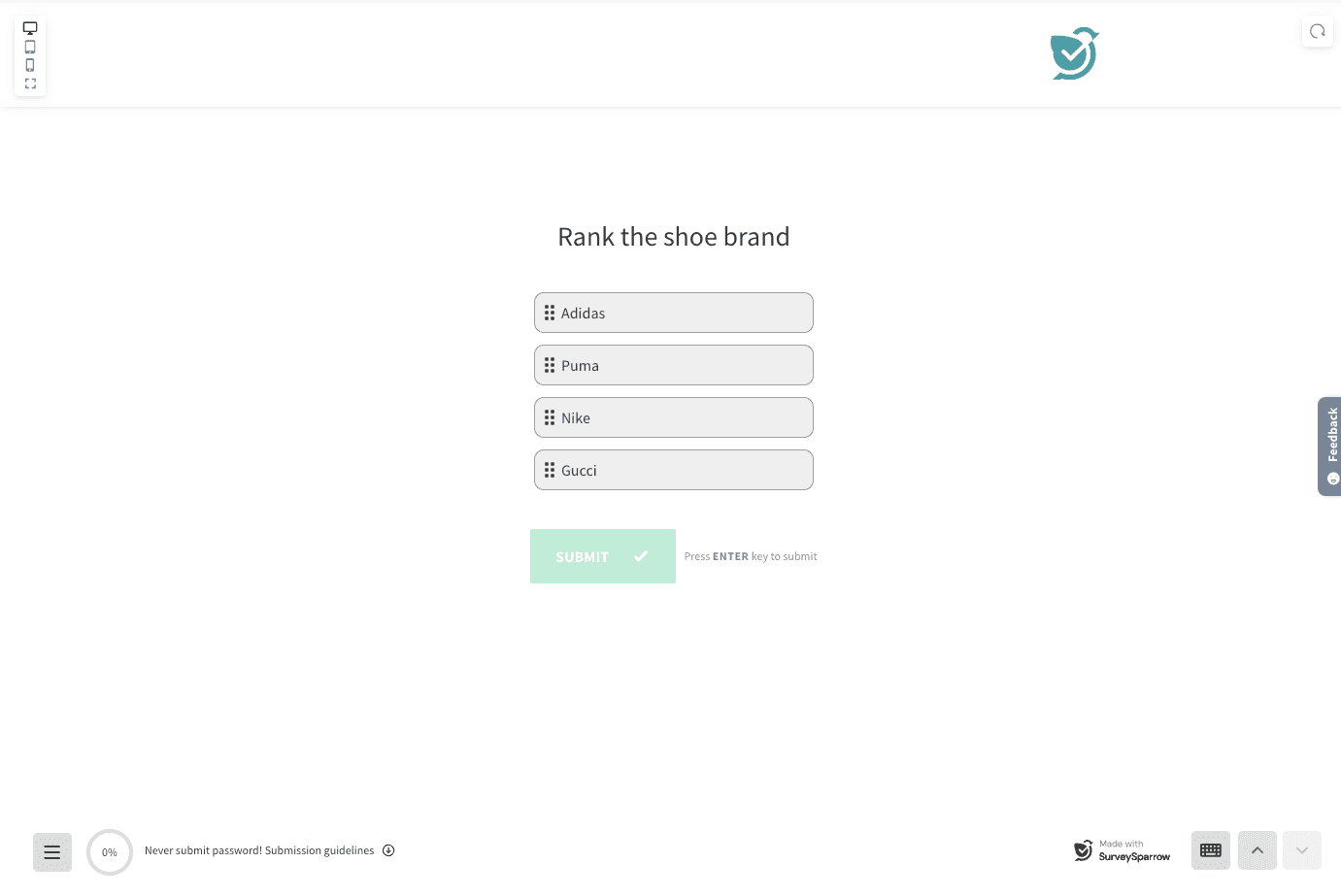
7. To hide option number for Rank order question
.ss-option--rank-order__select-wrap
{
  display: none;
}
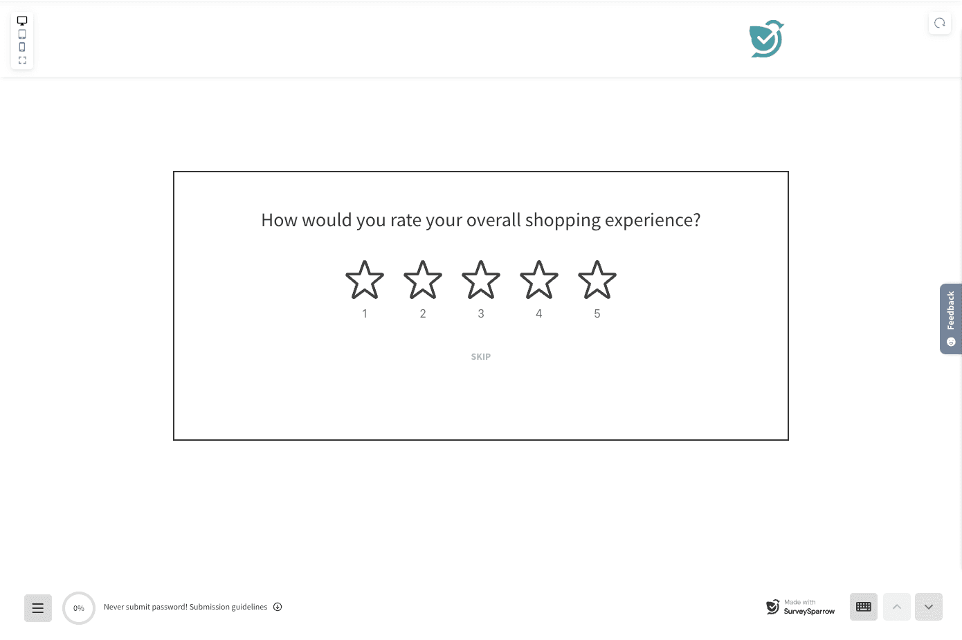
8. To add a border around the questions
.ss-fp-scroll__item-data-wrap .ss_cl_survey_qstn_item
{
    padding-left: 40px;
    padding-right: 40px;
    border: 2px solid;
}
9. To remove the description and its space on the Welcome page
.ss_classic_survey_intro_contents .ss-survey-heading--text + p
{
    display: none;
}
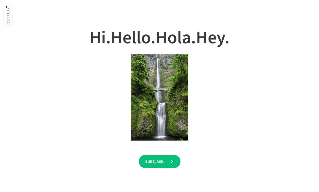
10. To remove the “Never share passwords” message at the end of the survey.
.guidelines-container--content-container {
  display: none !important;
}
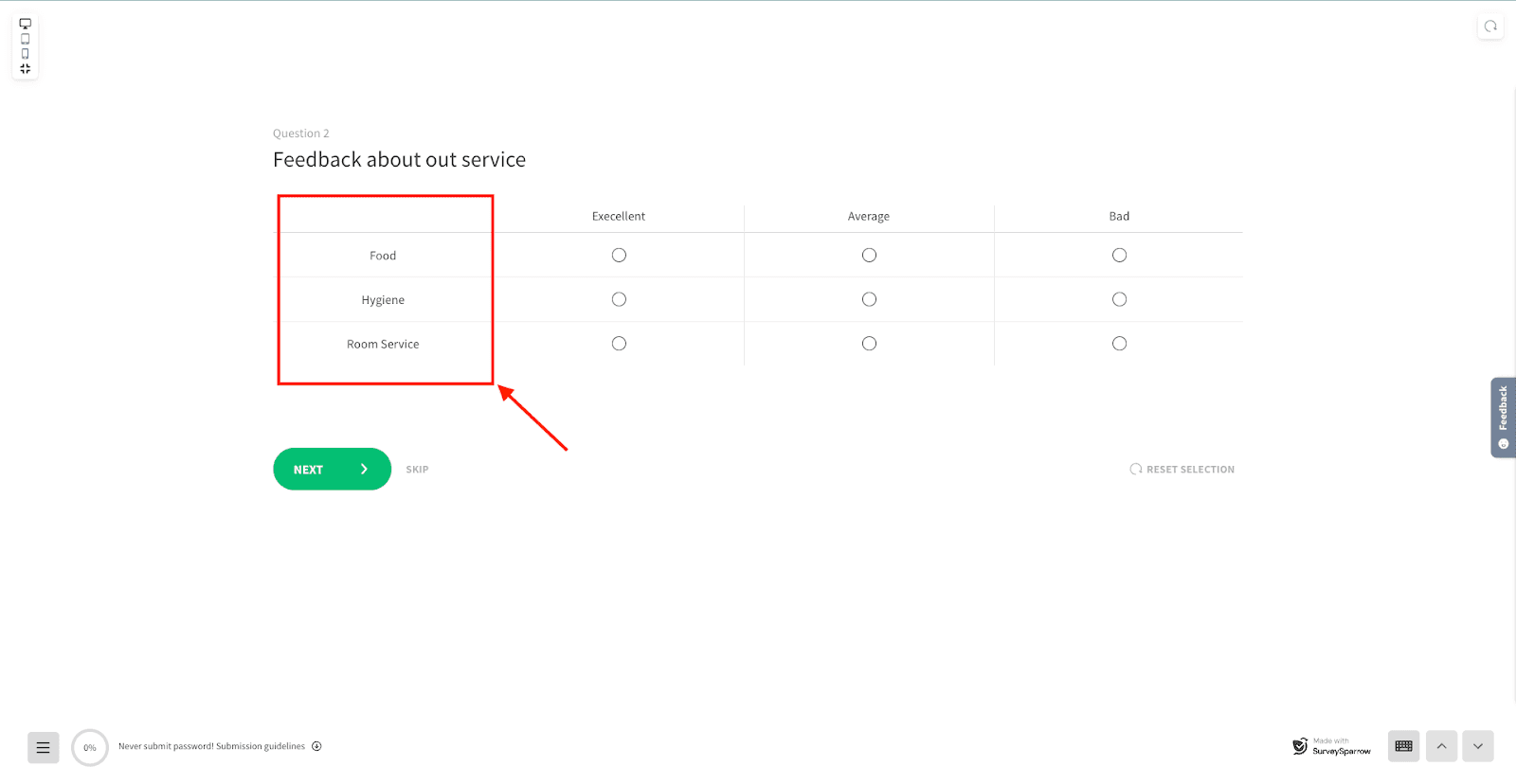
11. To align labels to the center for the Matrix question.
.ss_matrix_container.ss_matrix_container--classic .ss_matrix .ss_matrix_leftside .ss_matrix_column p
{
    text-align: center;
}
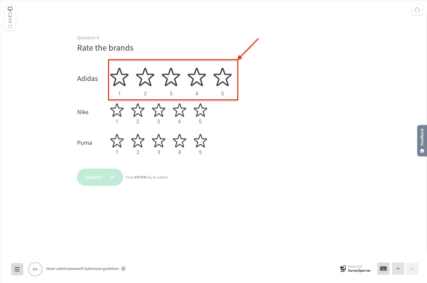
12. To customize the size of the first item in the Group rating question
.ss-group-rating-container:first-child .ss-group-rating-item__text p
{
    font-size: 24px; /* <- Font size of the first label */
}
.ss-group-rating-container:first-child .answer-option-rating--icons.answer
13. To make a specific line of a section title green-colored
.ss_cl_survey_qstn_item.active:not([data-qa-question-type]) .ss_cl_survey_qstn_right h1 p:nth-child(1)
{
    color: green;
}
14. To hide the “Choose as many as you like” helper text for Multiple Choice questions when Multiple Answers is enabled
.surveysparrow-survey-container--classic-form .ss_cl_survey_qstn_item .ss_options_container .ss_multiple_choice__helper-txt {
  display: none !important;
}
15. To hide the key indicator shown beside multiple-choice options, add the following CSS to Advanced Styling :
.ss-answer-option--choice .ss-option-no {
  display: none !important;
}
If section titles appear larger/bold and there is excessive white space between section titles and the first question, or between rating-scale questions, you can adjust spacing using Custom CSS in the Advanced Styling editor. Example CSS used to resolve this included: adjusting the top positioning of rating answer options, padding adjustments for survey question items, margin modifications for question action elements, and bottom positioning adjustments for helper message containers.
For Chat surveys:
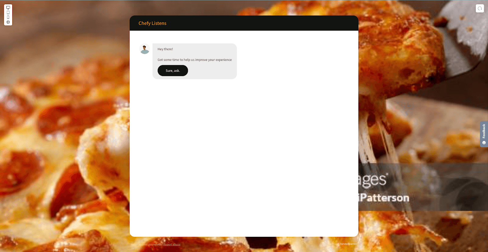
1. To change the font color for the chat survey header.
.surveysparrow-chat__header-left .ss-survey-text-size--xl
{
  color: orange;  /* apply your color here */
}
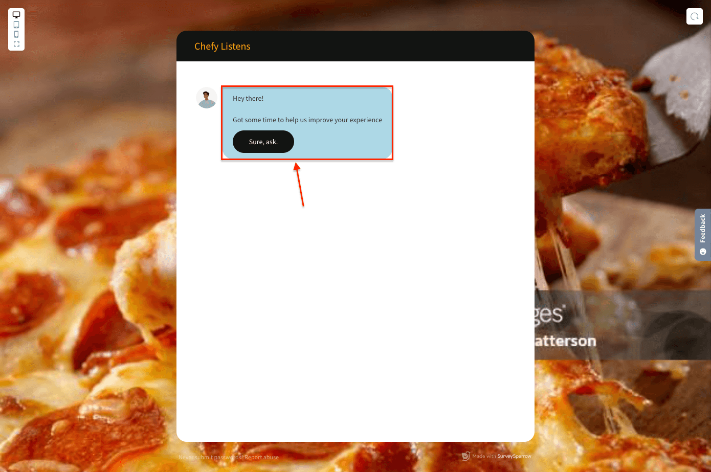
2. To change the bubble color of the chat.
.ss-chat-row__bubble
{
    background-color: lightblue;   /* apply your color here */
}
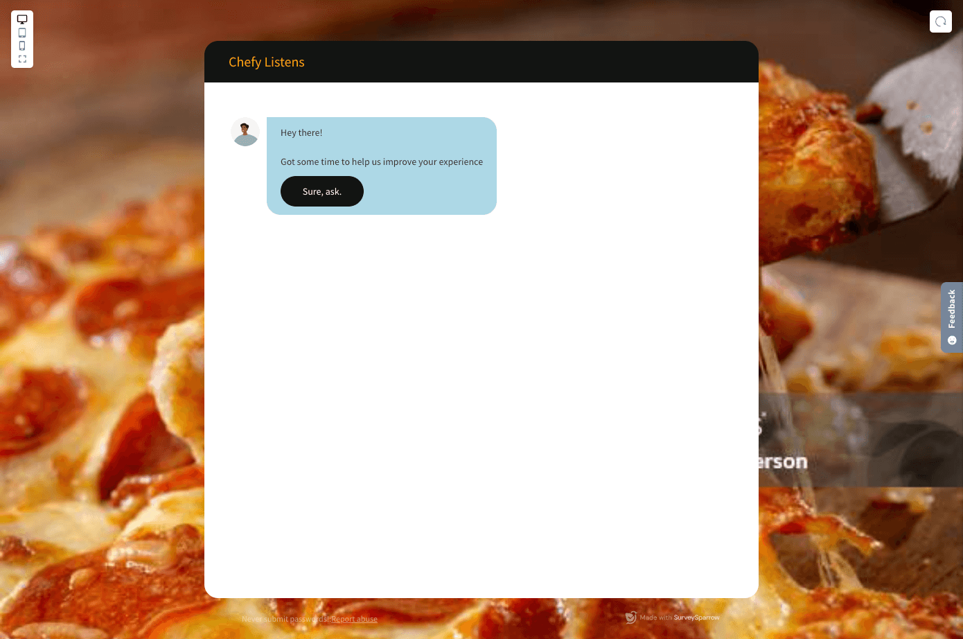
3. To change the width of the chat survey container
.surveysparrow-chat__wrapper
{
   max-width: 800px !important;
} /*change max-width to change the size of the container*/
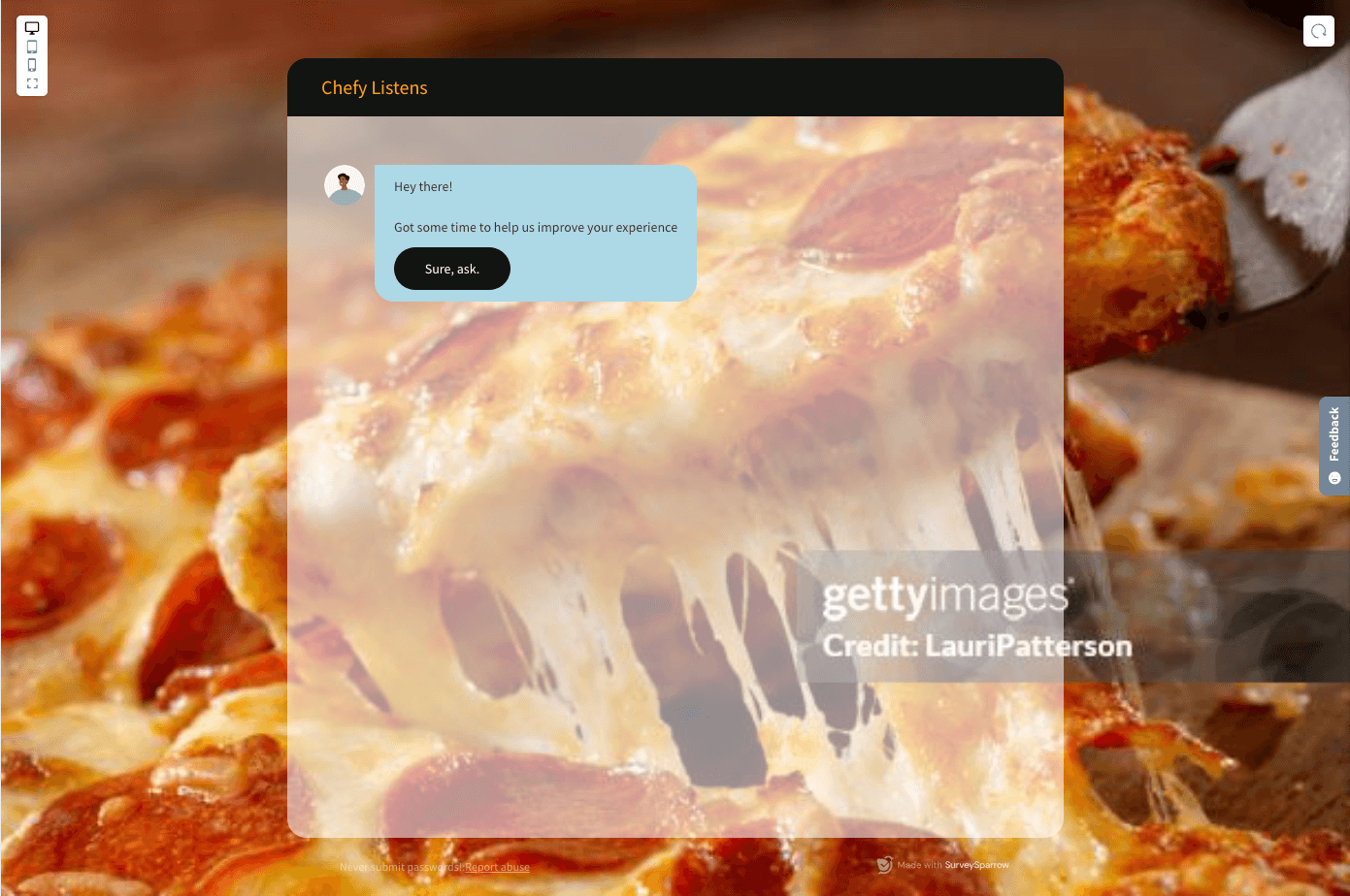
4. To make the chat interface color transparent.
.surveysparrow-chat__split-layer
{
   /*adjust transparency with values ranging from 0 to 1;*/
   background: rgba(255, 255, 255, 0.5);
}
.surveysparrow-chat-userinput
{
   background: transparent;
}
5. To change the width of the embedded video.
.ss-chat-row .ss-chat-row__bubble .ss_video_wrapper
{
    width: 400px; // <-- Change to desired width
    max-width: 100%;
}