Key Driver Widget
The Key Drivers provides a data-driven way to identify drivers of the outcome metric. It also helps understand how these drivers collectively influence a single outcome such as customer satisfaction, Overall Rating, NPS, CSAT, CES, or effort score. Using advanced regression-based statistical techniques, it evaluates all potential drivers together rather than individually. This approach reveals both the strength of each driver’s impact (importance) and your current performance on them, giving a clear, holistic view of what truly affects the outcome.
With these insights, you can prioritize which areas to improve, maintain, or adjust focusing your efforts on the factors that have the greatest effect on customer experience and loyalty.
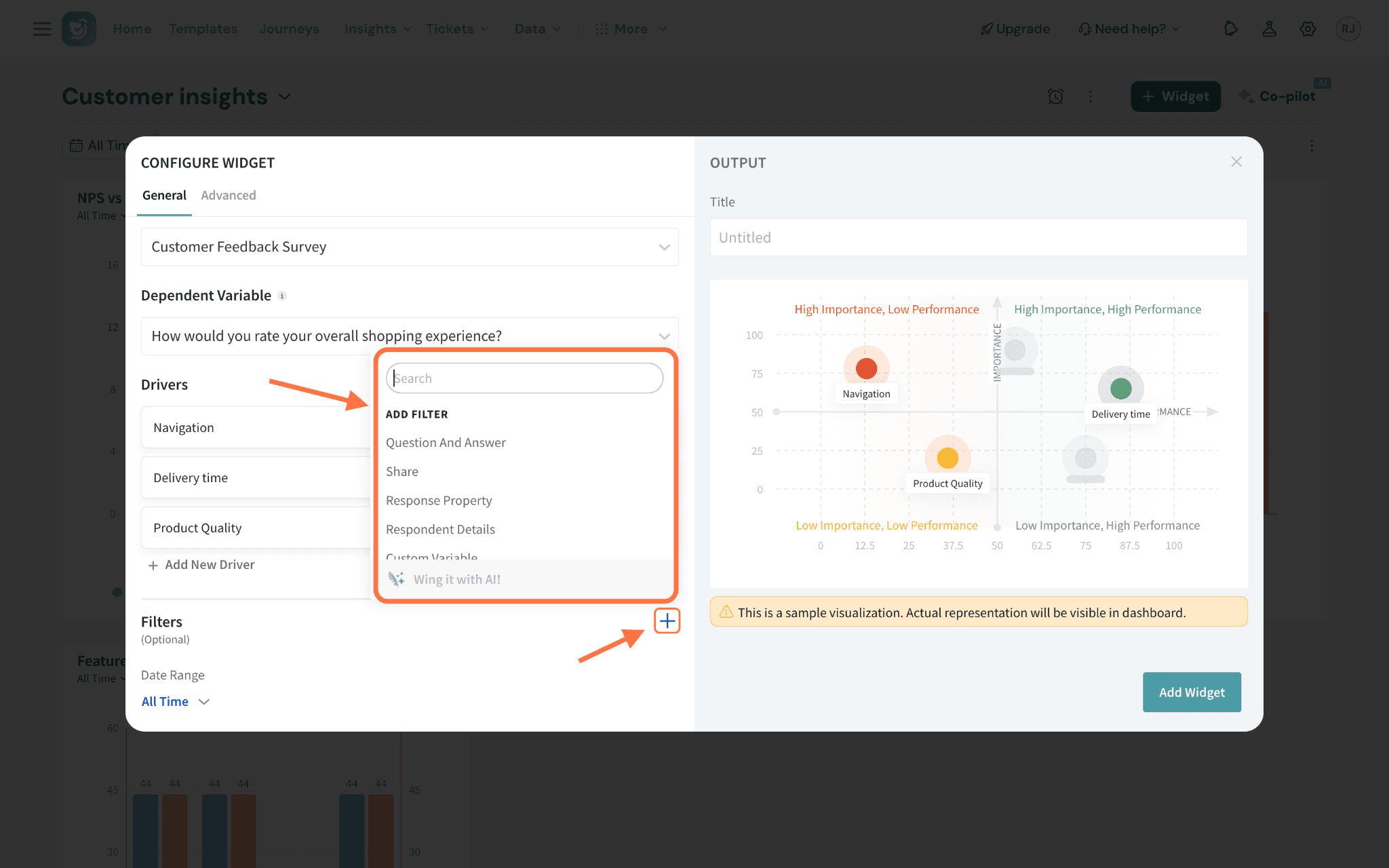
What does it do?
Visualizes each driver on a quadrant chart showing:
- Importance (Y-axis): Output of the RIA regression model (0 to 100)
- Performance (X-axis): Calculated using weighted average, converted to a 0–100% scale.
This helps identify:
- Key Drivers (high importance, high performance)
- Improvement Opportunities (high importance, low performance)
- Nice-to-Haves or Low priority areas (low importance)
Let’s look at an example to better understand.
A restaurant chain wants to improve its overall rating based on customer feedback collected after each visit. While they track several aspects of the dining experience like atmosphere, food quality, and speed of service, they’re not sure which of these has the greatest influence on how guests rate their experience.
Using the Key Driver Widget, they can:
- Analyze multiple variables together to understand their impact on overall rating.
- Identify which factors have the strongest influence on customer experience.
- Validate or challenge internal assumptions with data-driven insights.
- Prioritize improvements based on what matters most to customers.
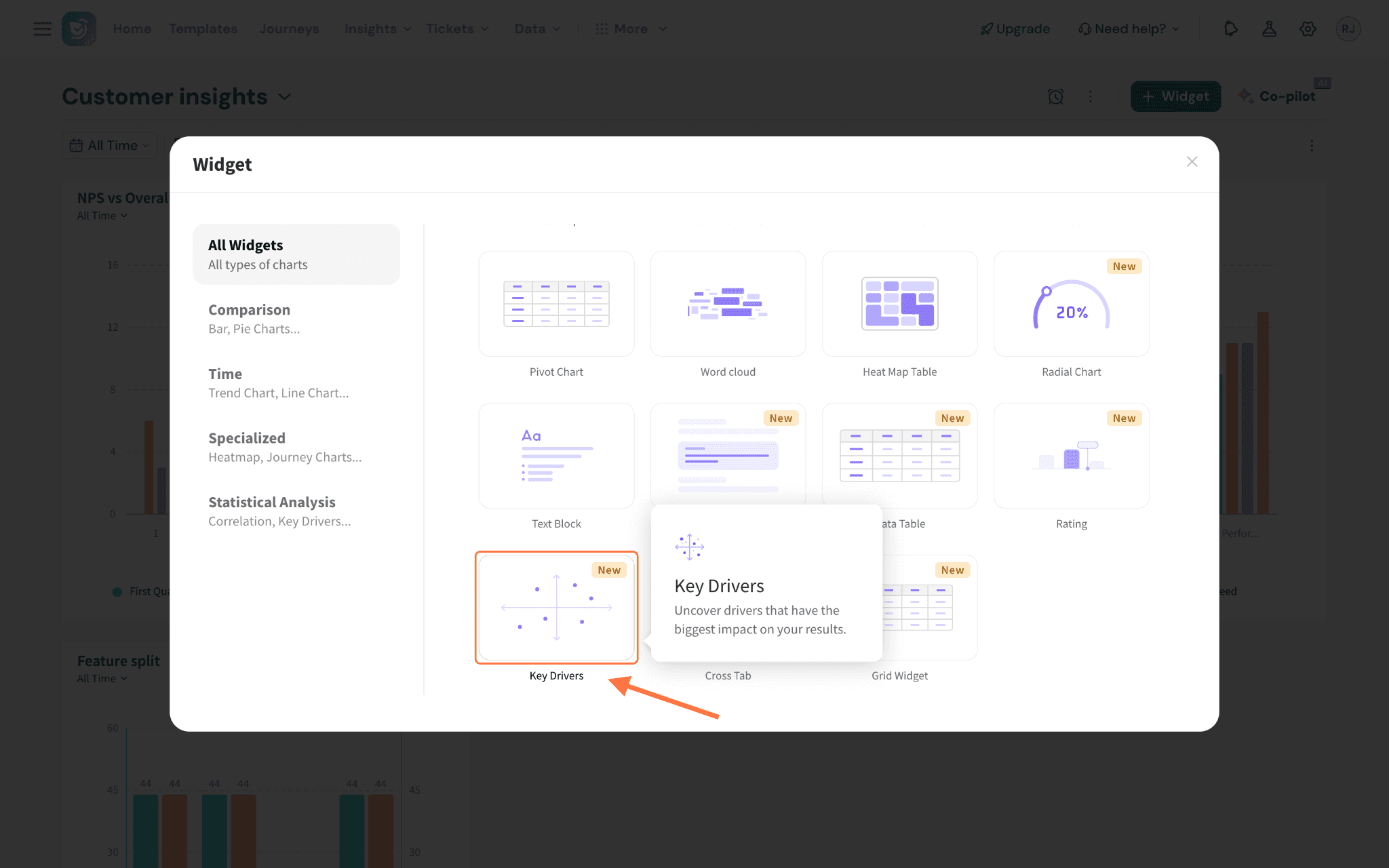
Let’s see how to create a Key Driver widget.
1. Navigate to Insights and go to Dashboards.
Note: The following are the supported question types:
- NPS
- CSAT
- CES
- Rating question
- Opinion Scale question
- Group Rating question
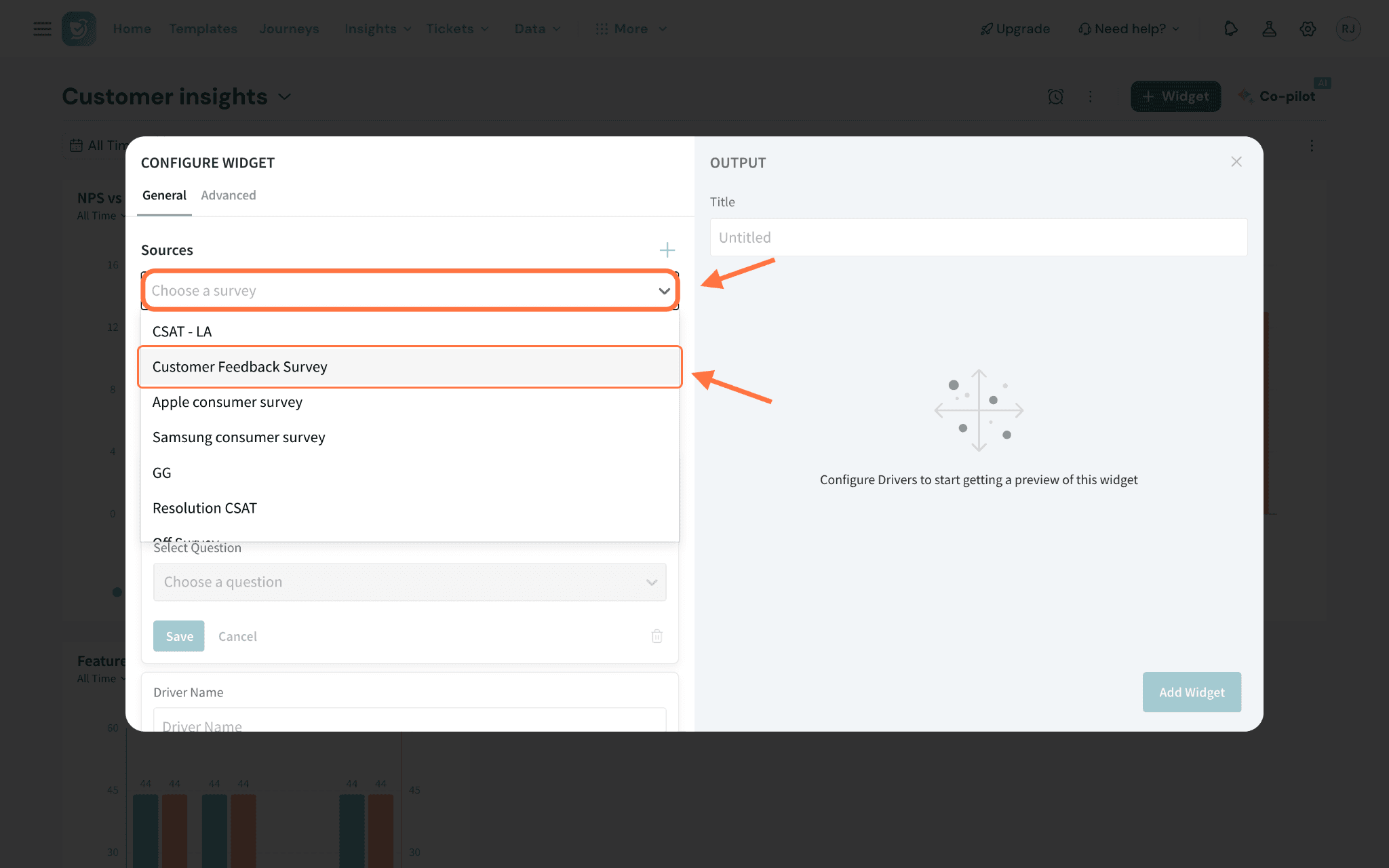
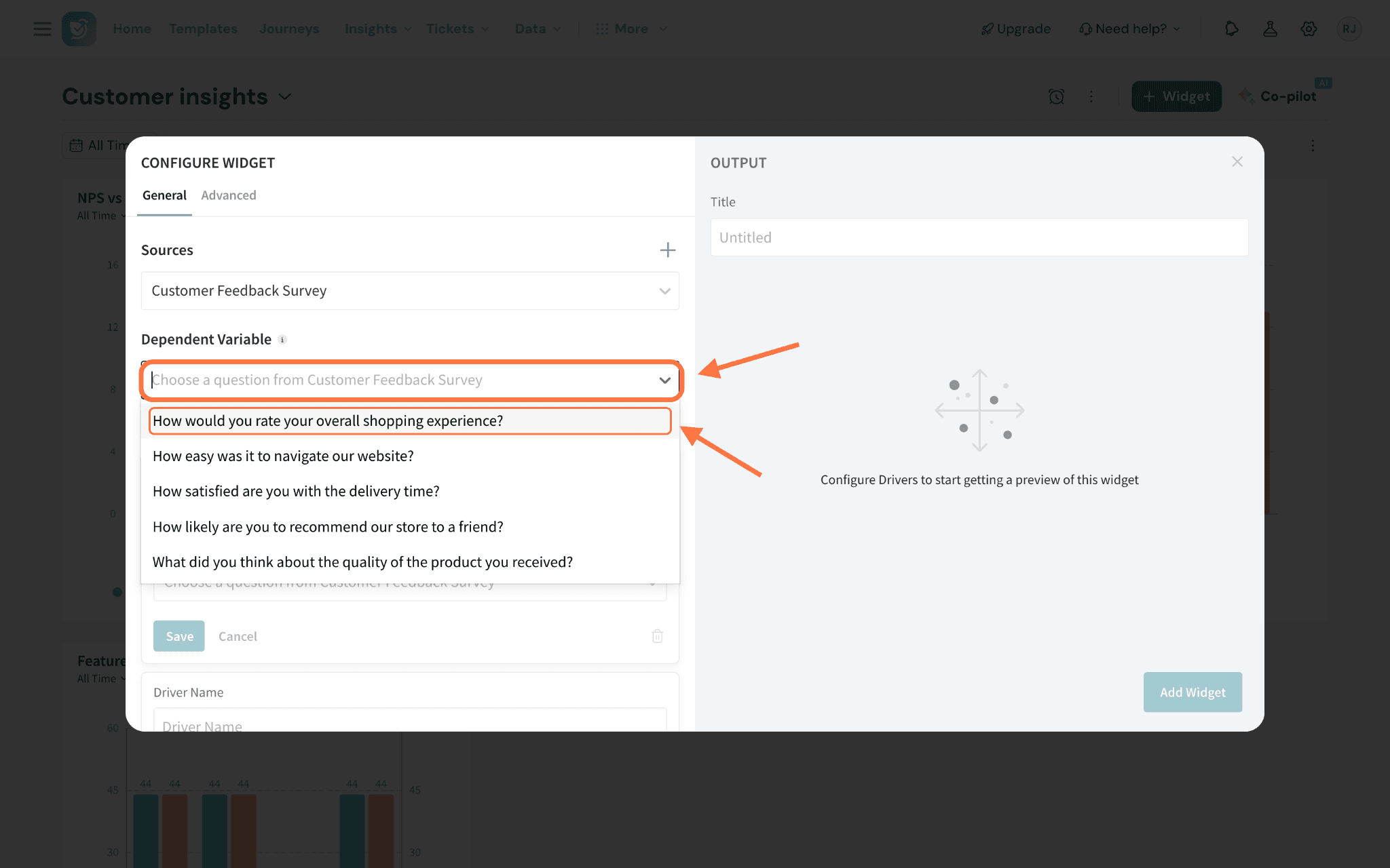
Note: You will be able to add up to 15 drivers.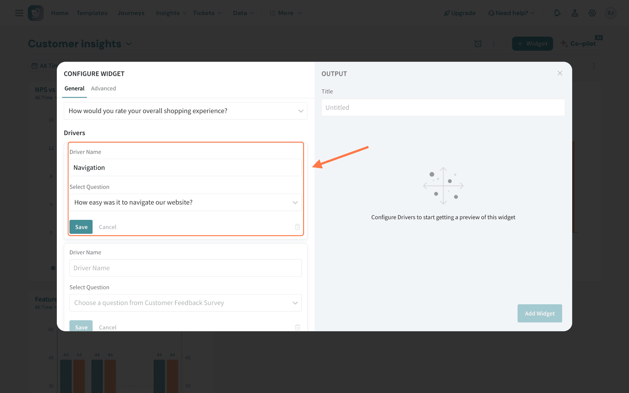
Advanced Configuration
1. Show records count: This option displays the number of data records used in the correlation calculation in the dashboard. It helps you understand the volume of data supporting the analysis, giving context to the reliability of the results.
2. Importance Axis (Y-axis): This represents how strongly each driver influences the selected outcome, based on the output of the RIA regression model. You can configure its threshold in two ways: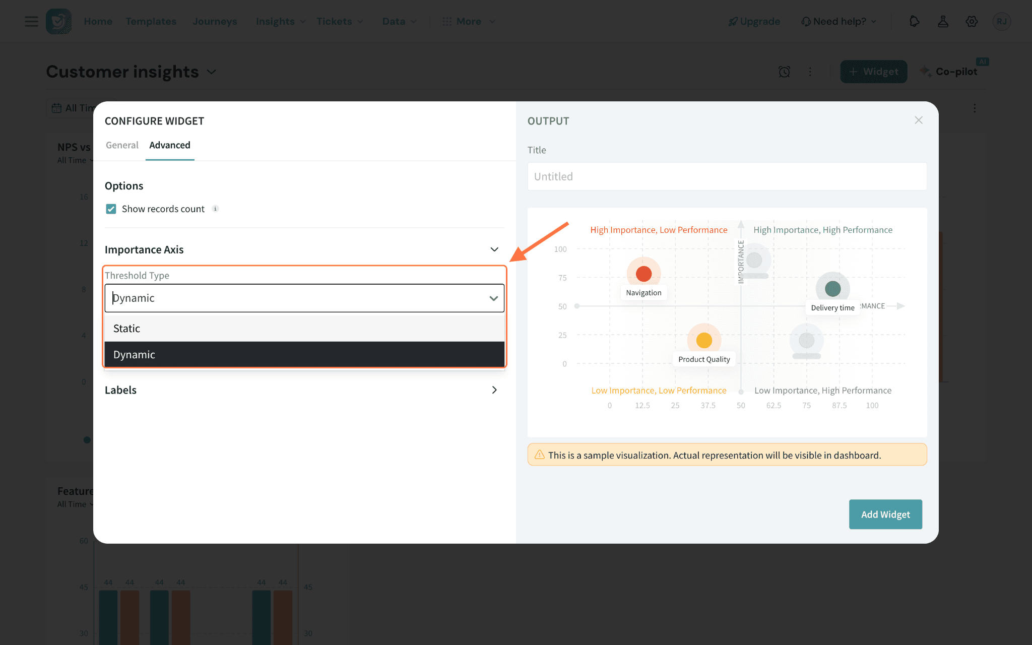
- Dynamic (Default): The threshold adjusts automatically based on the data.
- Static: You can manually set a threshold value between 0 and 100 (default value: 50).
Note: By default, the importance axis is set to static, but you can switch to dynamic and define your own threshold.
3. Performance Axis (X-axis): This reflects how each driver is currently performing, based on a weighted average converted to a 0–100% scale. To understand how the weighted average is calculated, refer to the Performance calculation section.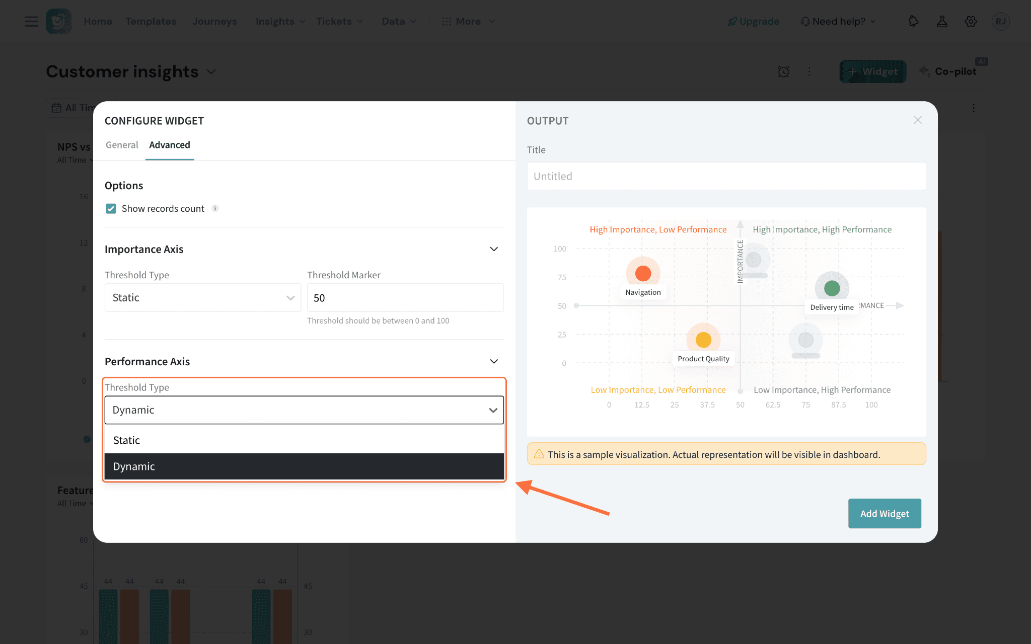
- Dynamic (Default): The threshold adjusts automatically based on the data.
- Static: You can manually set a threshold value between 0 and 100.
Note: By default, the performance axis is set to dynamic, but you can switch to static and define a custom threshold if needed.
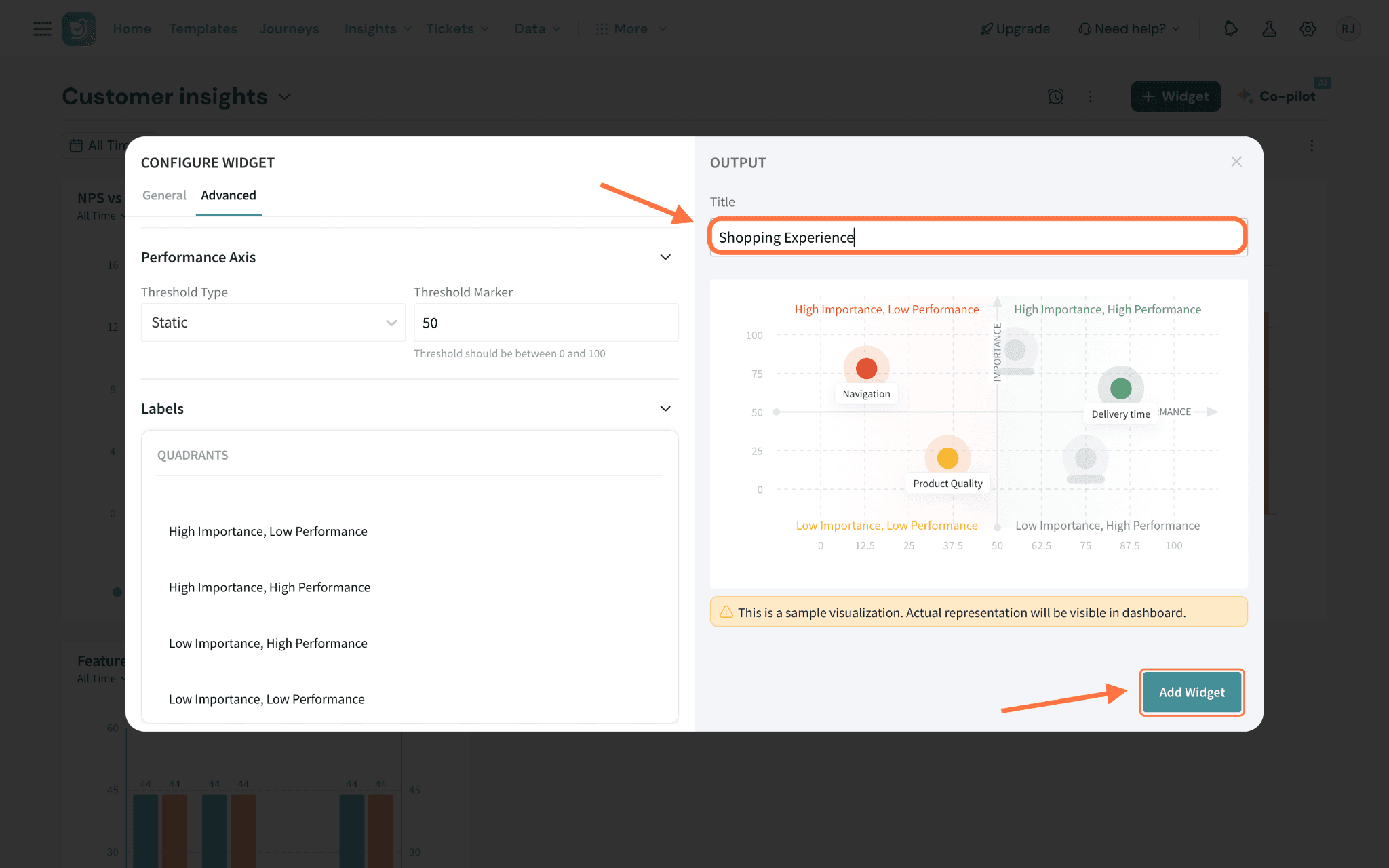
4. Labels: You can customize the names or labels for each quadrant to match your internal terminology or reporting preferences.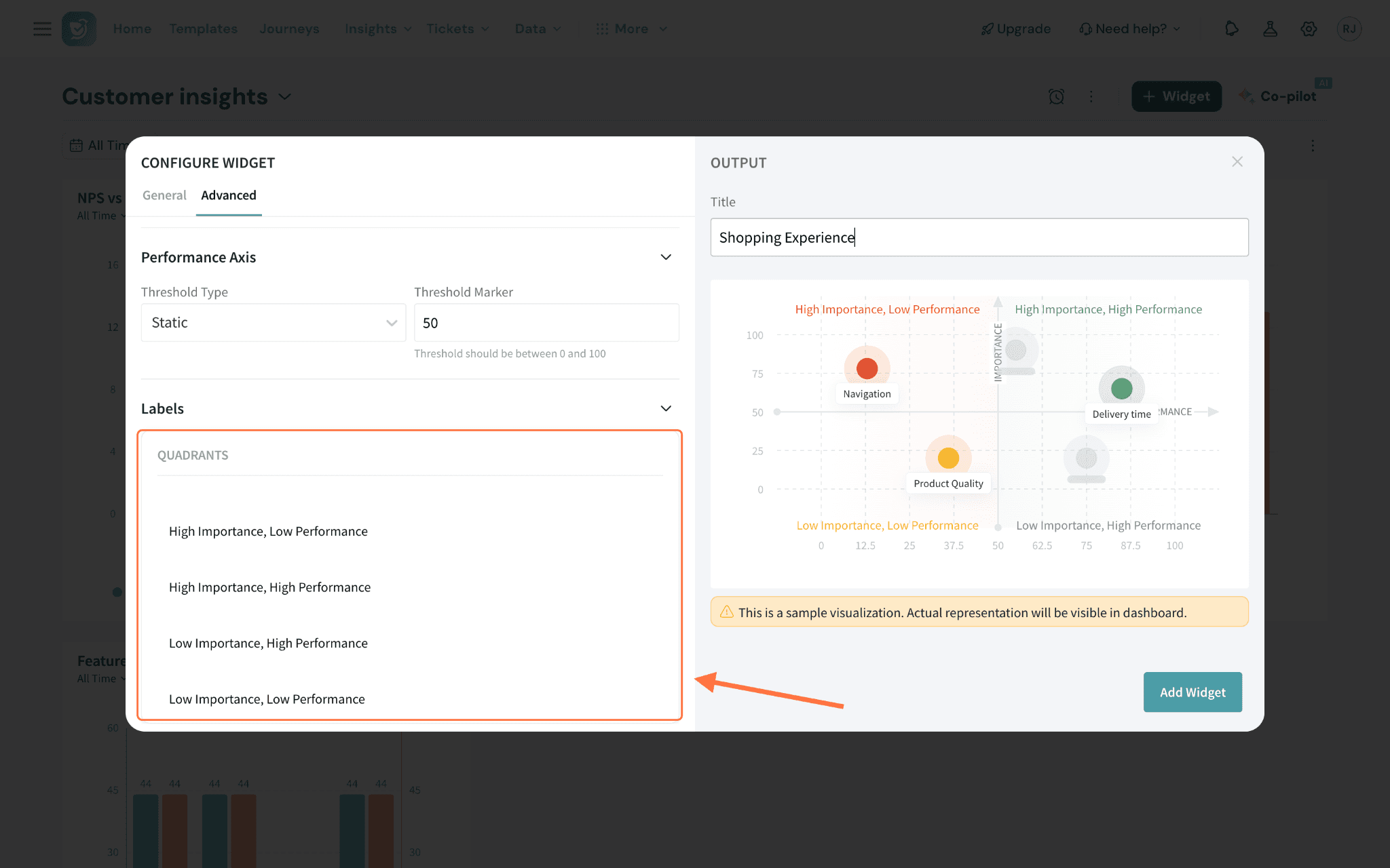
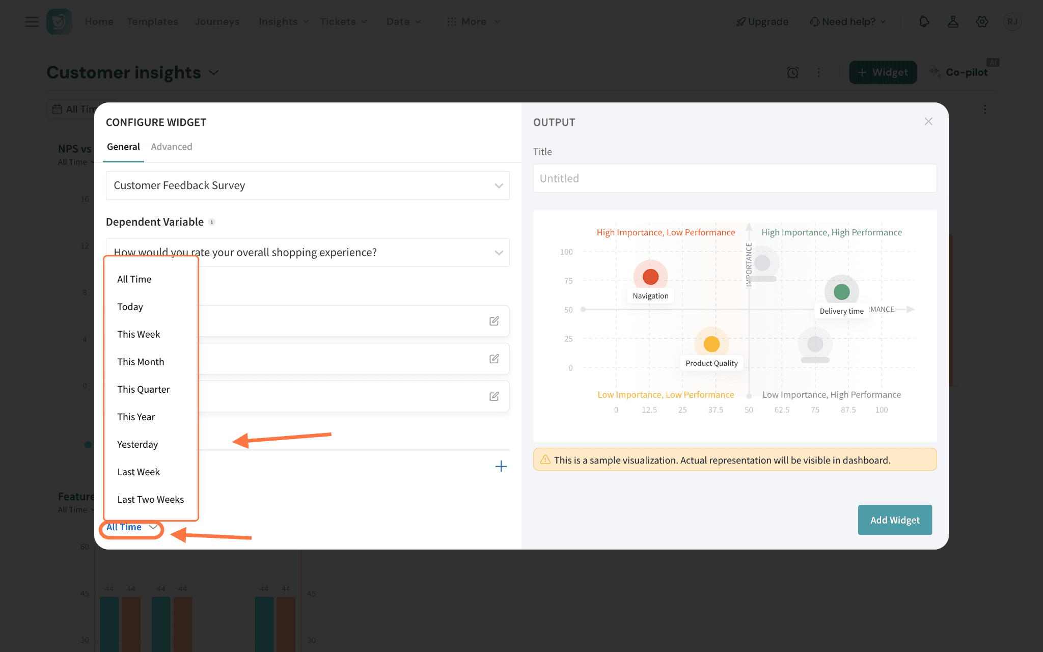
If a new filter is applied while the widget is still recalculating, you can cancel the ongoing recalculation and restart it with the updated filter.
Filters cannot be applied to the Key Driver Widget by users with view-only access.
Performance Calculation
Here we’ll discuss the calculations that are used to present the performance axis mentioned above.
Let’s take an example to understand the calculation.
A restaurant chain wants to understand their performance on the Speed of Service metric, based on customer ratings collected after each visit.
Customers rate service speed on a scale from 1 (poor) to 5 (excellent).
Here’s the distribution of ratings from 100 customers:
Rating | Number of Responses |
5 | 5 |
4 | 20 |
3 | 40 |
2 | 25 |
1 | 10 |
Step 1: Calculate the Weighted Average Rating
Multiply each rating by the number of customers who gave that rating, sum the results, and divide by the total number of customers.
Weighted Average = ((5 × 5) + (4 × 20) + (3 × 40) + (2 × 25) + (1 × 10)) / 100
= (25 + 80 + 120 + 50 + 10) / 100 = 285 / 100 = 2.85
Step 2: Convert Weighted Average to a Percentage
Since the rating scale ranges from 1 to 5, convert the weighted average to a percentage using the formula:
Performance % = (Weighted Average - Minimum Rating) / (Maximum Rating - Minimum Rating) × 100
= (2.85 - 1) / (5 - 1) × 100 = 1.85 / 4 × 100 = 46.25%